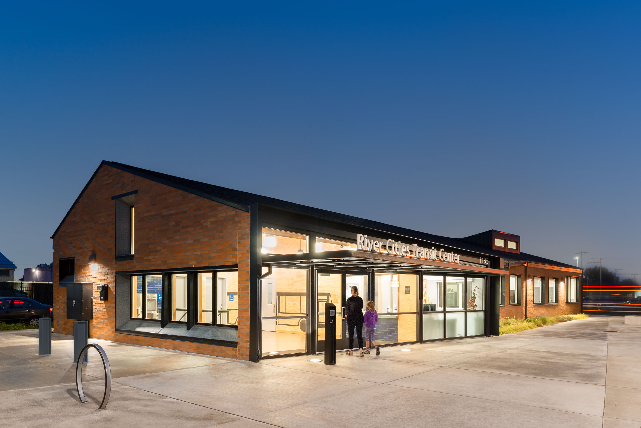
Designed to withstand a constant onslaught of hard use, the RiverCities Transit Center addresses the intersection of public space and public service with a focus on dignity and respect for both riders and staff.
Rebranding as RiverCities Transit (RCT) in 2012, a public transportation system operated by the City of Longview, WA, RCT contended with continual challenges at their downtown center. Slightly under 1 acre and home for the transit hub since the 1980’s, the site sits within a gritty light industrial/commercial zone adjacent to the central downtown business area. With goals of improving the awkward and unsafe flow of buses, addressing undesirable activities including overnight sleeping in the bus shelters, and affording its drivers and transit staff a safer, more welcoming, and more maintainable environment, RCT sought to re-imagine and rebuild this public asset.
Engaging a wide array of stakeholders in the process, the design team worked to thoroughly identify the frustrations and liabilities experienced by RCT at the transit center. Moving beyond the discouraging realities they faced, an optimistic mindset formed around “what could be”, shifting the perspective towards an approach rooted in human psychology: to create an environment that, while tough and resilient, is intentional about caring for people.
Descriptions of undesirable personal conduct were paired with ideas for encouraging better behavior, undergirding RCT’s stated values of “Safety, Security, Service, and Schedule”. Using these 4 S’s as a guiding framework, a new outlook emerged to inform the design process. Simply stated: Design with human dignity in mind, and people will tend to behave with dignity.
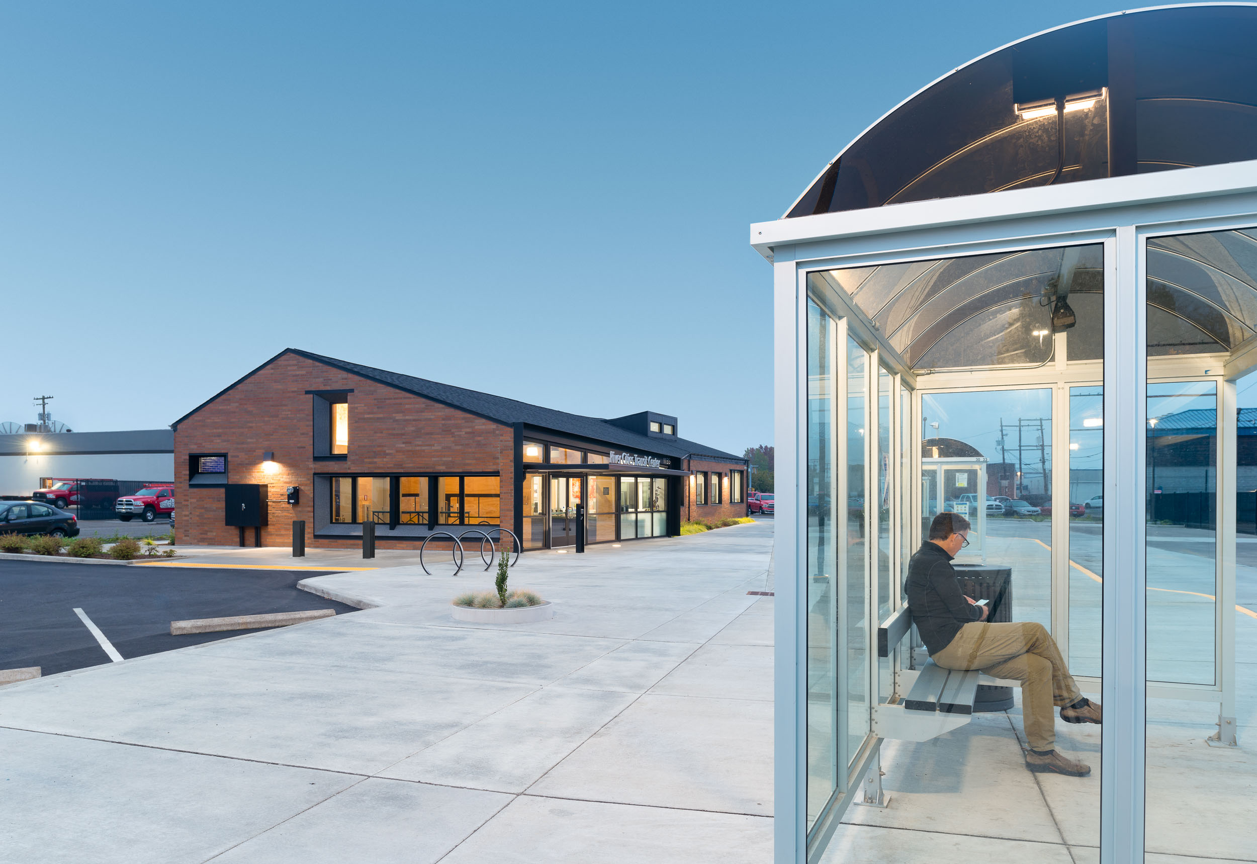
Limited funds ($3 million total project budget) underscored the need to employ efficient yet effective moves to maximize positive outcomes. The previous two-way bus flow and unsafe pedestrian circulation was reworked to provide single directional flow, allowing an open, oasis-like plaza to form between the buses and the new building. Simple, transparent shelters discourage overnight camping, while understated landscaping incorporates garden beds and seating with integral planters.
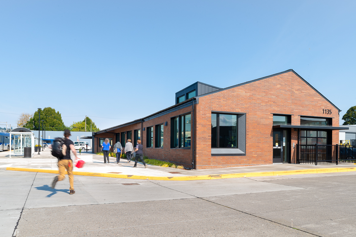
The building design solution employs traditional, familiar massing and materials to encourage positive encounters outside and within interior public spaces. The structure itself casts a comfortable silhouette, its warm terra cotta brick rising to a steady gable; a simple abstraction of human-scaled residential architecture. In a subtle move to the otherwise straight, rectangular form, the east end of the building flairs slightly while the west end projects outward in a welcoming gesture, each creating view angles for increased visual supervision to the plaza.
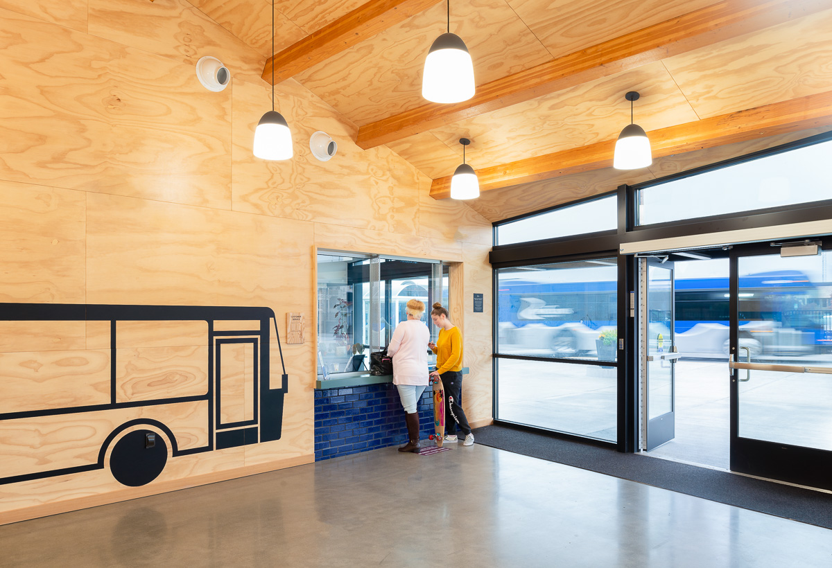
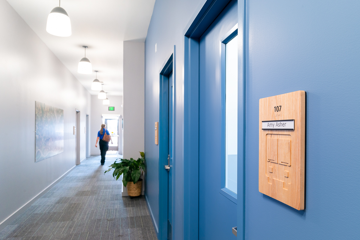
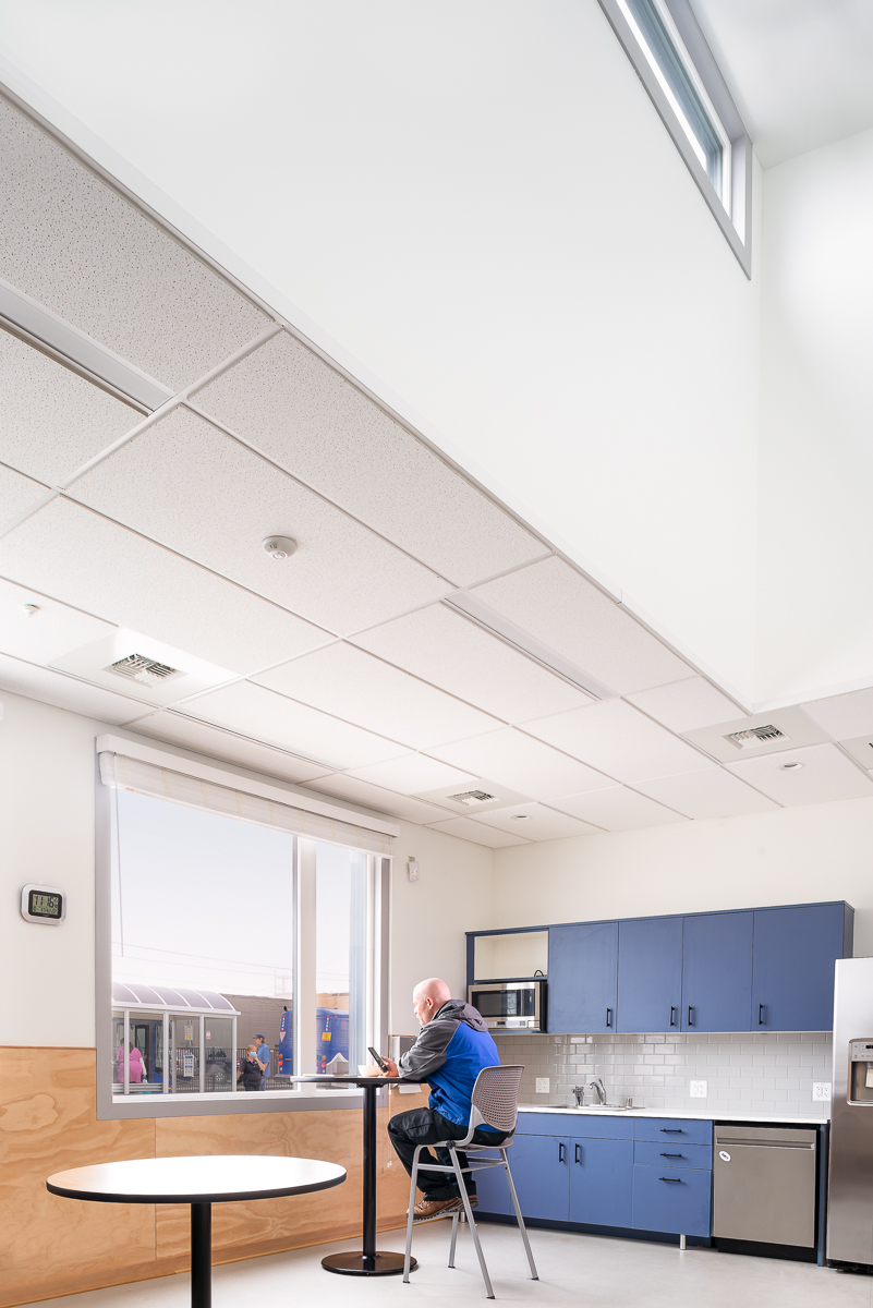
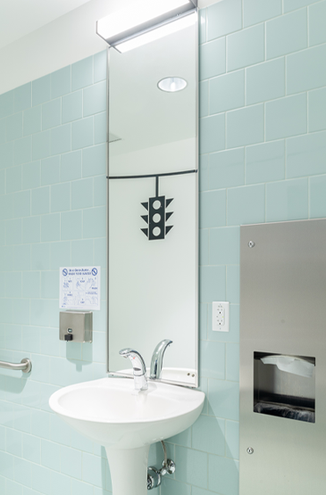
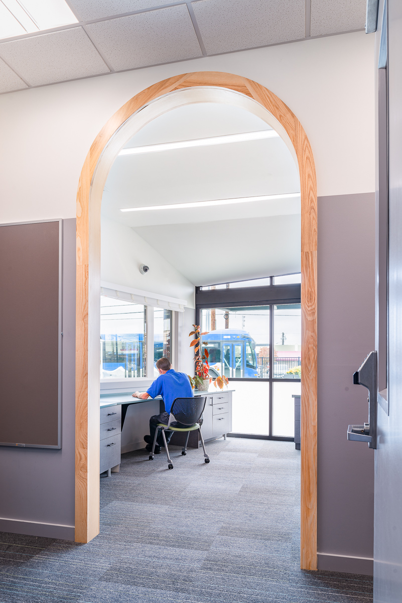
Interiors are designed to ensure a safe, secure environment for transit staff, drivers, and riders while offering unexpected moments of delight in the way of materials, color, transparency, openness, and graphics. The cumulative effect of these design moves creates a unique-yet-familiar place, where the need for durability and a watchful presence doesn’t compromise a dignified and pleasant experience, soothing and inspiring transit riders and staff alike.
